The Frutiger Family
Frutiger Aero was the dominant design language roughly from 2004-2013, widely used in tech, advertising, and branding. It bridged Y2K Futurism’s chaotic visuals and the rise of Flat Design, offering a more polished, human-centered Web 2.0 aesthetic. As interest grew, communities began categorizing its variants and related corporate styles. Interested? Click to explore them.
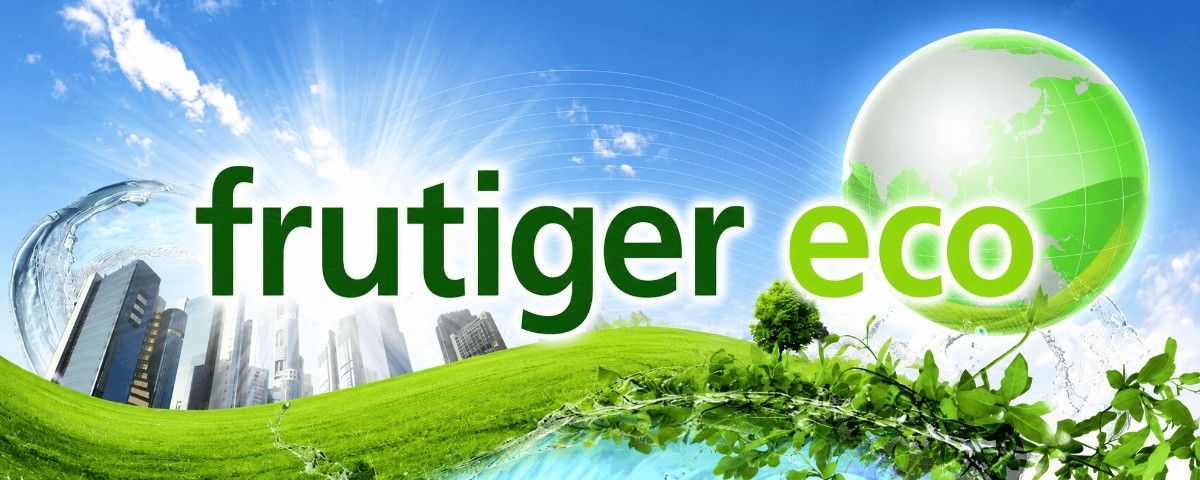
Frutiger Eco is a glossy mid-2000s design aesthetic that blends futuristic technology with idealized nature through bright greens, blues, and eco-themed imagery.
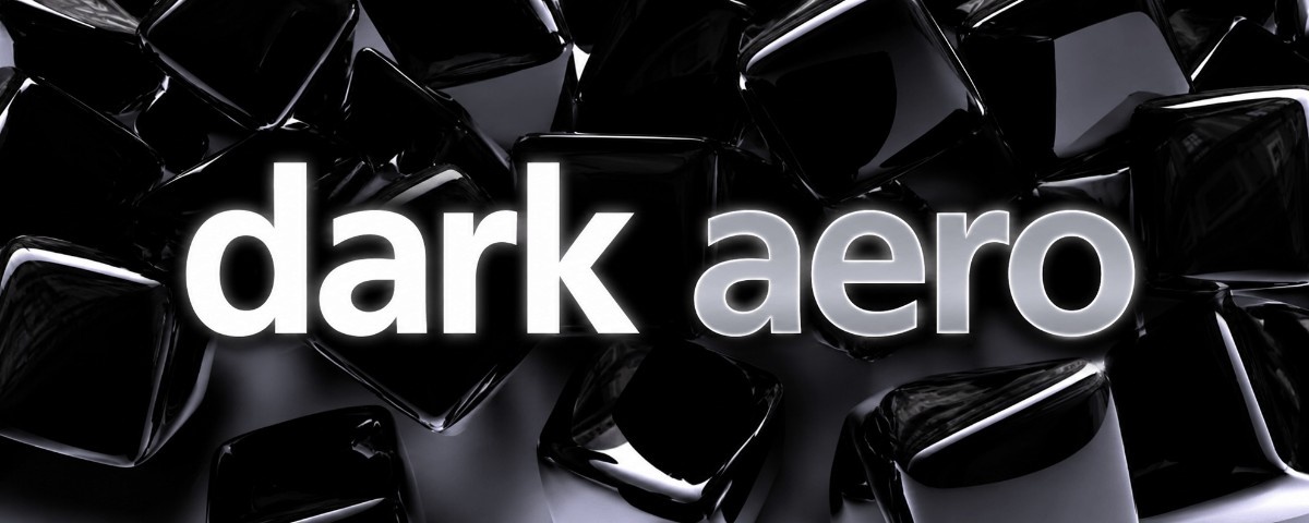
Dark Aero is a darker, minimalist version of Frutiger Aero that used aero glass effects and futuristic styling, often for high-end tech branding.
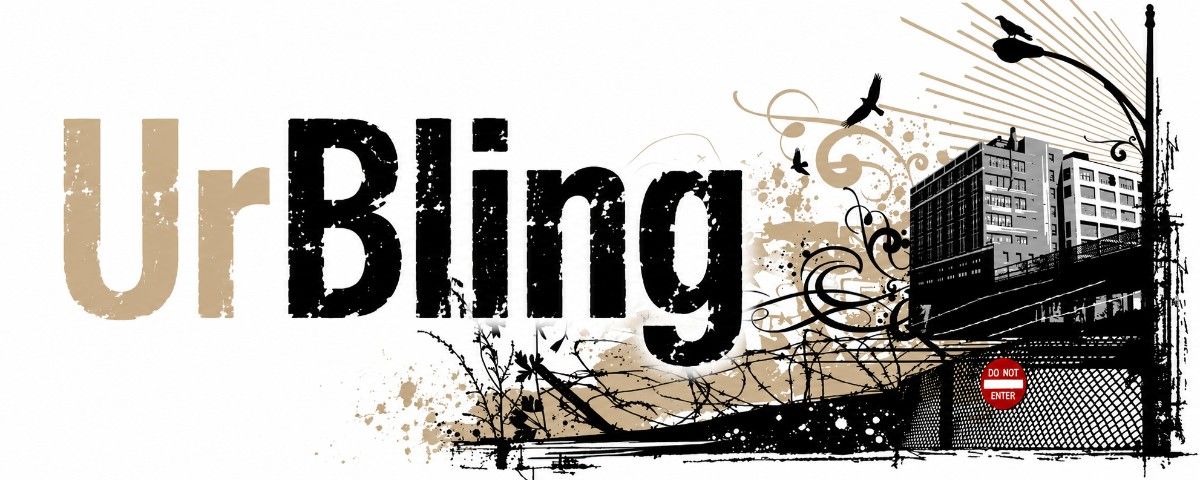
UrBling is an urban grunge aesthetic blending graffiti, corporate grunge, and Kustom Kulture, with less focus on “bling” and more on gritty urban style.
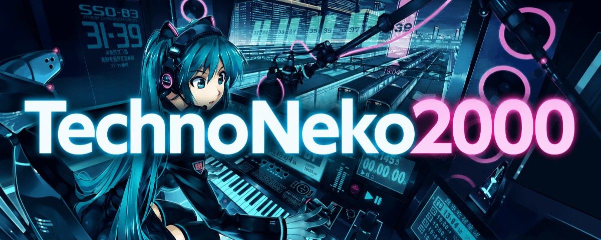
TechnoNeko2000 is an anime internet aesthetic combining moe character design with glossy, tech-optimistic Frutiger Aero visuals and early music upload culture.
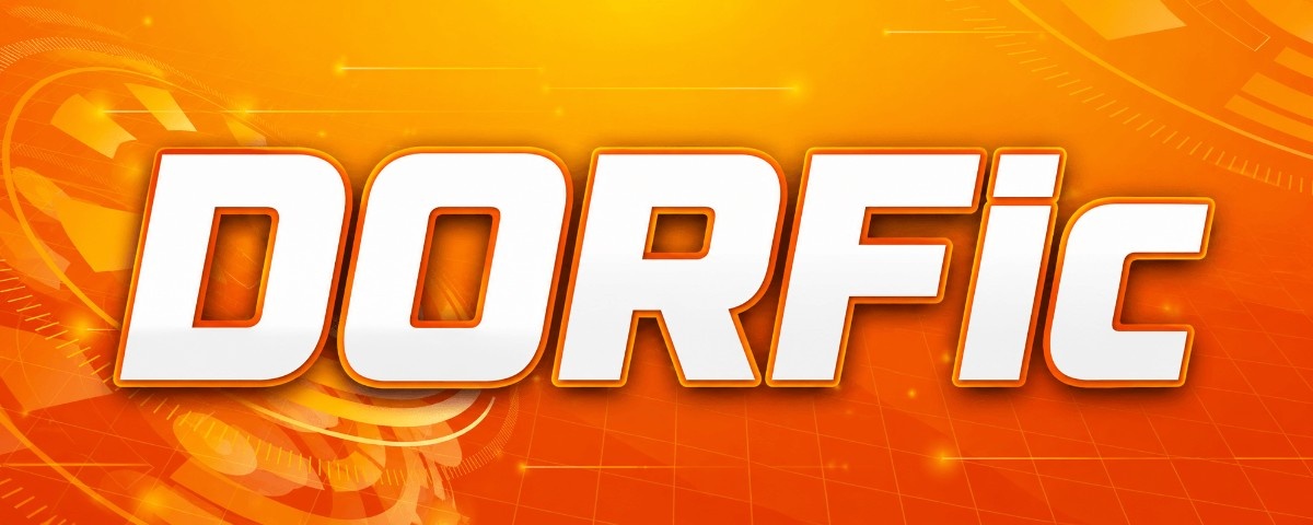
Dorfic is an abstract tech aesthetic using minimalist industrial visuals, defined by orange-red futurism and graphic design influences within Frutiger Aero.
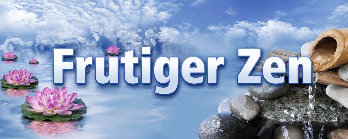
Frutiger Zen is a wellness aesthetic using glossy CGI nature scenes inspired by East Asian tranquility, blended with Frutiger Aero’s polished digital style.
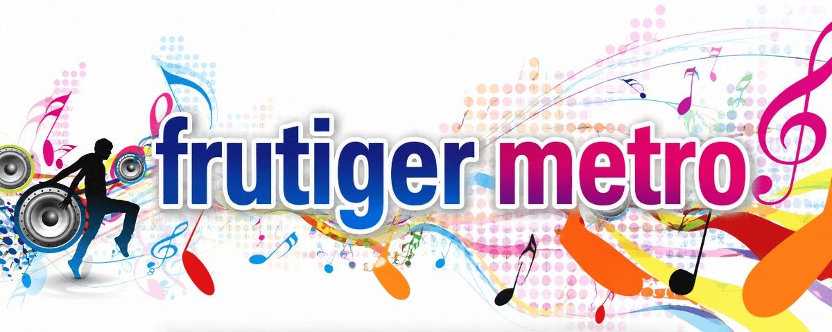
Frutiger Metro is a vector-based design style using bold gradients, abstract shapes, and clean maximalist graphics, unlike Frutiger Aero’s realism.
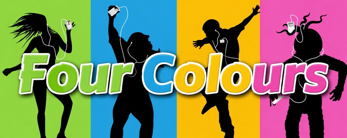
Four Colours is a consumer aesthetic using electric lime, sky blue, hot pink, and neon orange, influenced by Superflat Pop and Frutiger Aero.
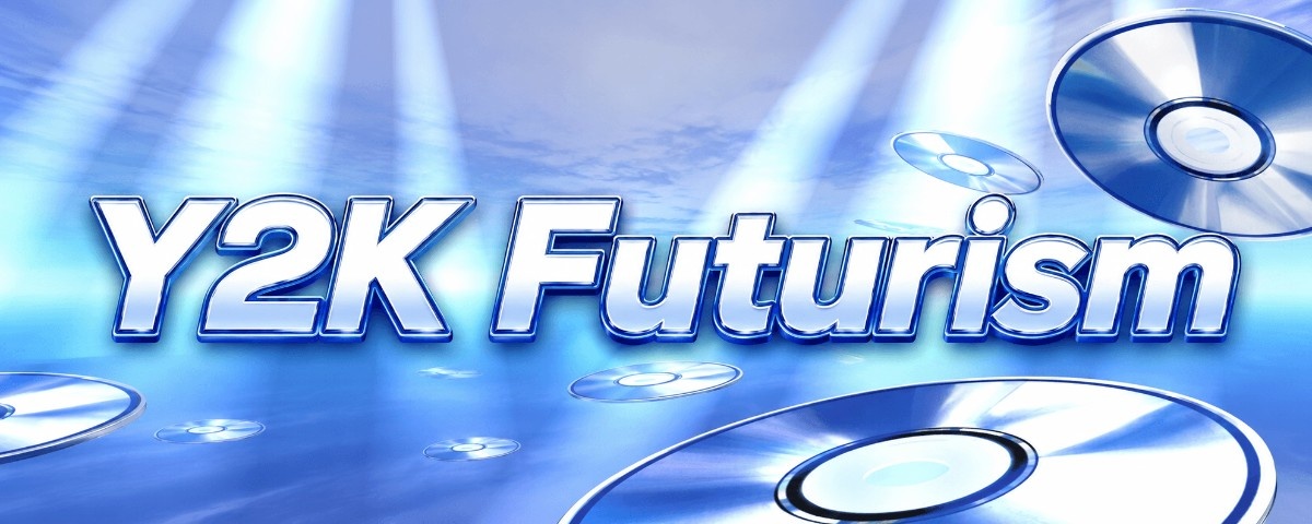
Y2K Futurism is an aesthetic defined by sleek, tech-optimistic design inspired by the dot-com era, later replaced by Frutiger Aero.
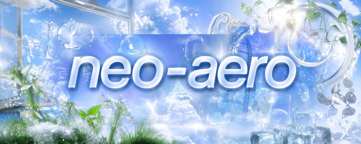
Neo-Aero is a 2020s nostalgia-driven revival of Frutiger Aero, exaggerating its glossy, optimistic tech aesthetic in digital art, memes, and online culture.